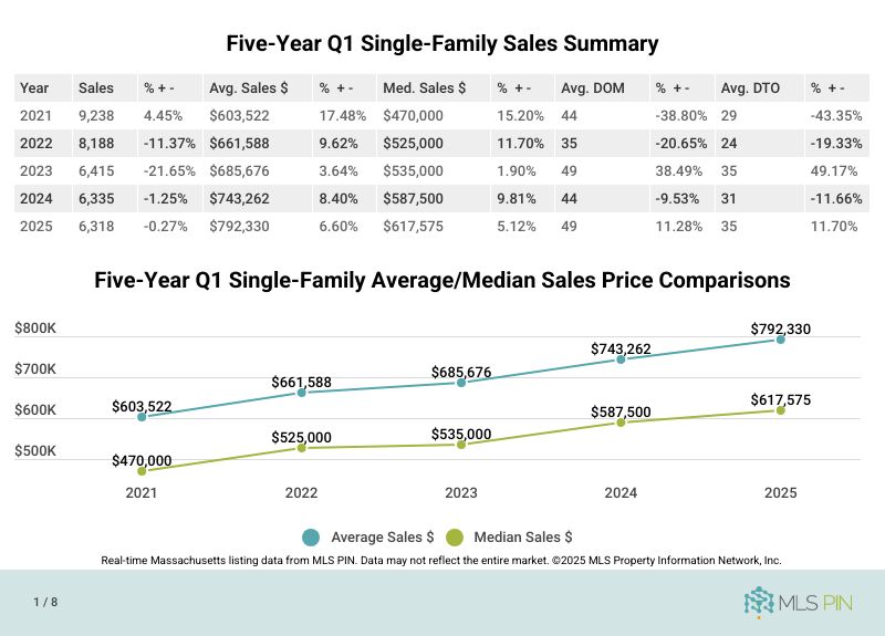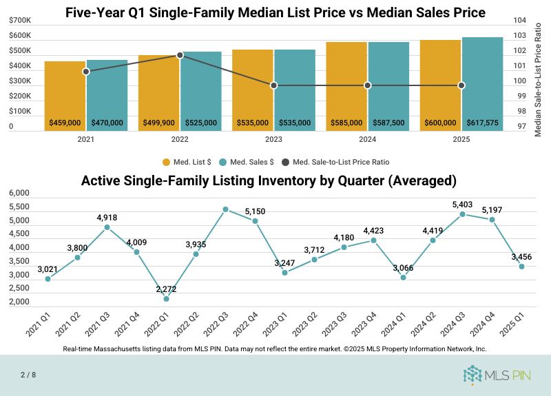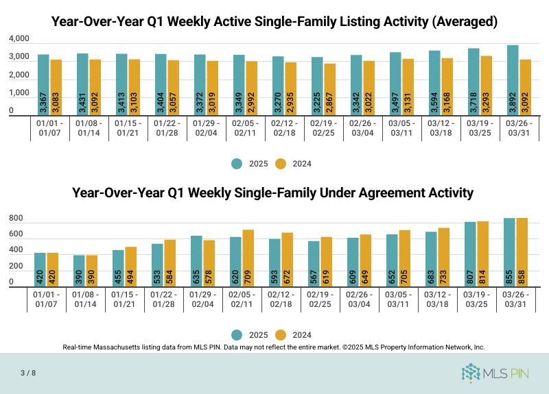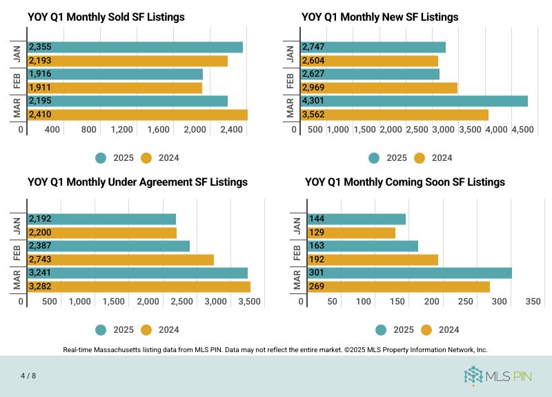
The state of the real estate market is usually not the most popular story in this newsletter, for a couple reasons, a big one being that unless you are a real estate agent or buying or selling a house, most people don’t much care how the real estate market is performing. It’s like reading an article on how computers or cars are selling.
However, the real estate market is relevant to people’s lives for a couple obvious reasons: it’s almost every homeowner’s largest asset, and their mortgage is often their biggest expense (unless you’ve got kids in college). If you don’t own a home, renting is usually your largest expense, but there’s no asset to counterbalance it. It’s quite odd if you think about it. You have to live somewhere, but renting and owning produce radically different financial results.
Also strange is that the cost to buy a house is extremely dependent on the interest rate, which is the cost to borrow money, and this interest rate is controlled to a degree by the Federal Reserve, but also many other factors like inflation. Because a house is so expensive, most people have to borrow money to purchase a home. Most things aren’t like that. The cost of eggs, or milk or college don’t rise and fall with interest rates like a house does.
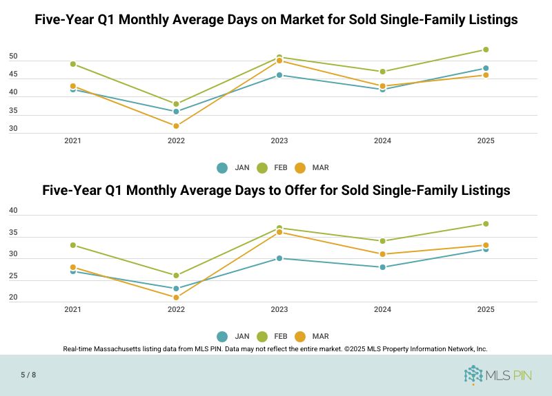
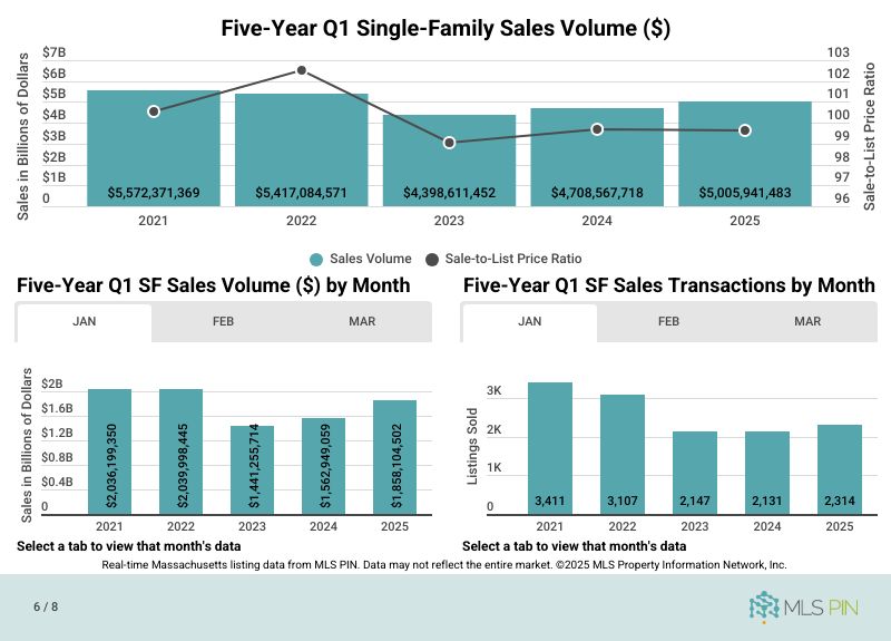
Because of this importance, and to see if people prefer my typical narrative of the state of the real estate market or if I’m talking to data people who love graphs, this month I’m using graphics provided by the Multiple Listing Service Property Information Network (MLSPIN or ‘the MLS’) to explain how 2025 has been month-over-month/year-over-year, so you can visually see what’s happening in the real estate market. To be honest, I’m also using graphs to tell this month’s state of the real estate market story because I’m writing this at 6am on a Saturday and have an open house to go to and need to get this issue of my newsletter out STAT.
